Note
- This tutorial is also available on nbviewer, offering an alternative platform for your learning convenience.
- 🔥 Free Pandas Course: https://hedaro.gumroad.com/l/tqqfq
In this tutorial we will learn how to create a basic pandas plot. Discover why MatPlotLib is Python’s default charting library and how it is used to create Pandas visualizations.
Pandas is built on top of Numpy and MatPlotLib. It uses MatPlotLib for most of its charting capabilities.
Tip: If you ever have a plotting question and are not finding an answer. Try searching for it using the MatPlotLib keyword instead of Pandas.
Let’s start by importing Pandas. Note that we do not have to import MatPlotLib as it is already part of Pandas. But in order to get the version of MatPlotLib installed on my machine, I need to import it as shown below.
You can set up your Notebook to automatically import frequently used libraries. To do this, search online for the specific steps. I personally try to avoid any custom configurations.
import pandas as pd
import matplotlib as mpl
import sys
Here are the versions of the libraries I’m currently on.
print('Python: ' + sys.version.split('|')[0])
print('Pandas: ' + pd.__version__)
print('MatPlotLib: ' + mpl.__version__)
Python: 3.11.7
Pandas: 2.2.1
MatPlotLib: 3.8.4Let’s steamroll straight into creating our dataframe. We are going to be creating a Pandas dataframe out of a Python dictionary. If you haven’t seen my post on creating Pandas dataframes, I encourage you to do that before moving on.
Here we have a one column dataframe with a few numeric rows. This is the data we will be plotting.
df = pd.DataFrame({'hello':[345,56,678,4,2]})
df| hello | |
|---|---|
| 0 | 345 |
| 1 | 56 |
| 2 | 678 |
| 3 | 4 |
| 4 | 2 |
Plotting in Pandas
Plotting in Pandas is actually very easy to get started with. The very basics are completely taken care of for you and you have to write very little code. It does get a bit tricky as you move past the basic plotting features of the library. This is where ChatGPT is your friend.
By simply adding .plot(), you have yourself a Pandas visualization. We used to be able to resize the plot with the mouse but it seems that feature has been disabled.
df.plot()<Axes: >
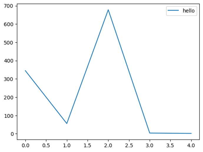
<Axes: > ???
Yes, I feel your pain. Why is this even here? When you create a plot in Pandas, it returns an axes object by default.
What is an Axes Object?
An axes object in Matplotlib is essentially the area of the plot where the data is plotted. It includes the x-axis, y-axis, and the actual plotting area where the lines, bars, or other plot elements appear.
Structure of a Plot in Matplotlib
A typical Matplotlib plot is composed of several key components:
- Figure: This is the overall window or page that everything is drawn on. It can contain multiple plots (axes).
- Axes: This is the area where data is plotted. A figure can contain multiple axes.
- Axis: These are the x and y axes that provide a reference framework for the data.
Why Does <Axes: > Appear?
The <Axes: > message appears because, in a Jupyter Notebook, when you create a plot, the default behavior is to display the representation of the last object returned by the cell. When you call the plot() function from Pandas, it returns an axes object, and Jupyter tries to display its string representation, which is <Axes: >.
The good news is that we can get rid of that pesky text by adding a semi colon at the end of our code cell like shown below.
df.plot();
Selecting Chart Type
In the past we were able to create different types of charts by using the parameter called kind. But now Pandas makes it even easier. Let me illustrate the two.
By setting the kind parameter to bar, we get a bar chart.
df.plot(kind='bar');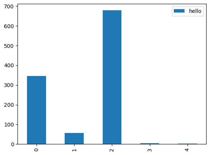
You can now pass the chart types as methods to plot and this makes it much easier. I recommend you discontinue the use of the kind parameter going forward.
Tip: Type df.plot. and then press the Tab key on your keyboard. This will show you all of the chart options.
df.plot.bar();
Styling your Pandas Visualization
When you are actually sifting through data and are concentrating, the default dot plot Pandas function works just fine. The only time you really want to style your plots is when you plan on presenting your work. This is where it becomes valuable to make things look pretty and readable to as many people as possible. Below we will go over a few examples to help you get there.
Oddly enough, assigning your plots to a variable makes this process a breeze.
- We start by adjusting the figure size. You can use the figsize parameter and select the width and height of your visualizations.
- We can also pass into the plot function the color parameter and change the default line color of the plot.
- The set_title function allows you to title your charts. You can also change the font size to your liking.
- The set_xlabel function allows you to title the x axis. You can also use the fontsize parameter here.
- The set_ylabel function allows you to title the y axis. You can also use the fontsize parameter here.
- The legend function accepts a Python list and lets you customize the legend labels.
p = df.plot(figsize=(15,5), color='green')

p.set_title('Hello World', fontsize=15)
p.set_xlabel('x axis')
p.set_ylabel('y axis')
p.legend(['testing']);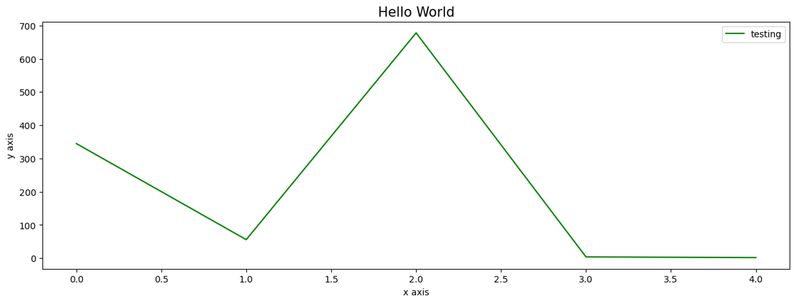
And that is it for today. You should have enough horsepower to get started on your own plots. If your plots don’t work or don’t look quite right, keep going. I was just using .plot() for years and I then picked up more plotting skills over time.
PANDAS HOME PAGE